Console Redesign to 70% Adoption in 3 Months
Five product areas, five design languages, zero shared patterns. Developers preferred raw JSON over the GUI. The interface was actively hurting the business.
Audited how everything was organized, built the design system from scratch, decoupled finance from security for enterprise accounts, and established the process for teams to add to it at scale.
70% voluntary adoption in 3 months. Foundational design system and navigation structure that powered Plivo's growth for the next 6 years.
The Challenge: The Ultimate UX Failure
Plivo's developer console served five distinct product areas (SMS, Voice, Phone Numbers, SIP Trunking, and Zentrunk). Because each was built by an isolated engineering pod, the console had five different design languages, navigation models, and UX patterns. There was no shared component library and no consistent behavior.
Support tickets revealed the extent of the friction, but the analytics revealed the fatal flaw: for actual product configuration, users preferred RYUK, an internal tool that exposed Plivo's APIs in raw JSON format, over the customer-facing console. When developers prefer raw data to your GUI, your interface is actively hurting the business.
My Role
I joined as Plivo's first in-house designer. My mandate was to audit the wreckage, define a unified navigation and page structure, build a scalable design system from scratch, and partner with UI developers to ship a complete redesign across all five product lines.
 The fragmented console: five product areas, five design languages, zero shared patterns
 The Audit & The RYUK Insight
I audited every product, benchmarking against competitors (Twilio, Nexmo, Messagebird). The friction fell into two massive buckets:
- Structural Debt (Navigation & Organization): Phone numbers were the central nervous system of every product, yet had no centralized management. Users could not buy or attach a number from within the product they were actively using. Furthermore, billing and account settings were entangled, creating a nightmare for enterprise customers trying to manage multiple sub-accounts and procurement teams.
- Design Debt: There were no standard patterns for forms, modals, filters, or tables. Because nothing was reusable, adding a simple feature required disproportionate engineering time.
Developers are the most honest user base in software — they route around bad interfaces instead of complaining about them. RYUK was the routing.
 Competitive audit and friction analysis across five product areas
 Building the Primitive Layer
I built a shared component library from the ground up: typography, color, spacing, forms, tables, navigation, modals, and filters. Components were standardized but flexible. For example, I designed a multi-level filter widget that expanded to hold dates, capabilities, and status in one action, eliminating the need for custom filtering logic in each product. All creation and editing flows were moved from disruptive modals into dedicated, stable page views.
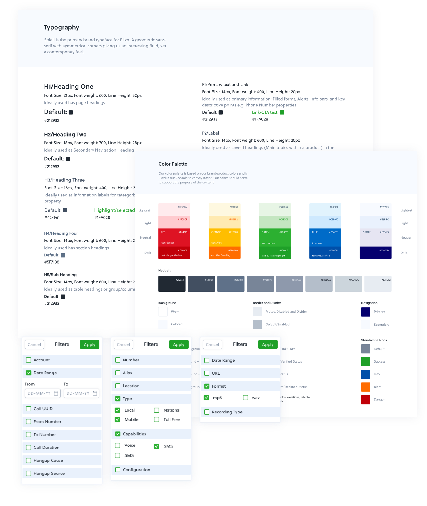 Shared component library: typography, color, spacing, forms, tables, navigation, and filters
 Key Architectural Decisions
The Navigation Pivot
I killed the combined top-and-side navigation, replacing it with a collapsible side panel. This freed up horizontal real estate for information-dense data tables and made toggling between product workspaces seamless.
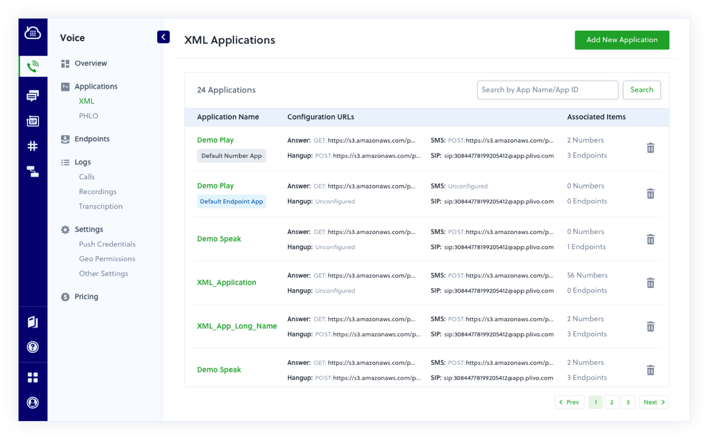 Collapsible side navigation replacing the combined top-and-side pattern
 Decoupling Finance and Security
I separated the monolithic "Account" section into two distinct pillars: Finance (payments, invoices) and Account Security (users, subaccounts, credentials). This structural change instantly solved a major friction point for large enterprise accounts managing multiple billing entities.
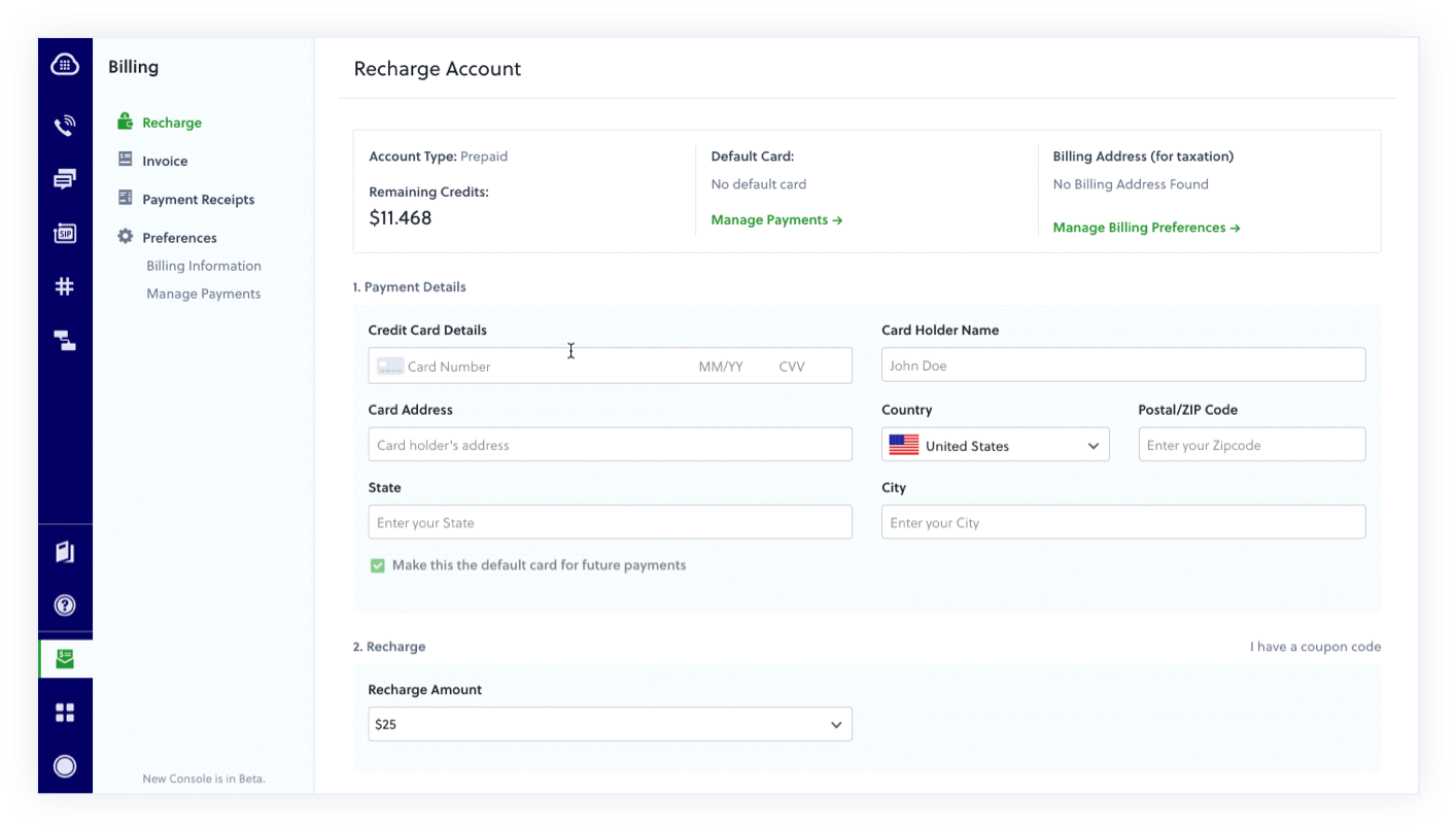 Finance and Account Security decoupled into separate pillars with role-based access
 Centralized Phone Numbers
I consolidated a multi-step, multi-page maze into a single global panel where users could view, configure, and attach numbers to applications instantly from anywhere in the console.
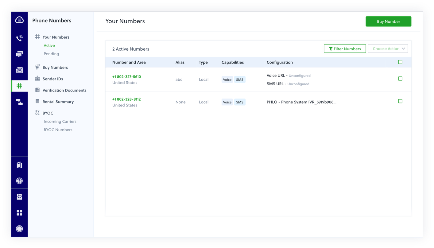 Centralized phone number management accessible from anywhere in the console
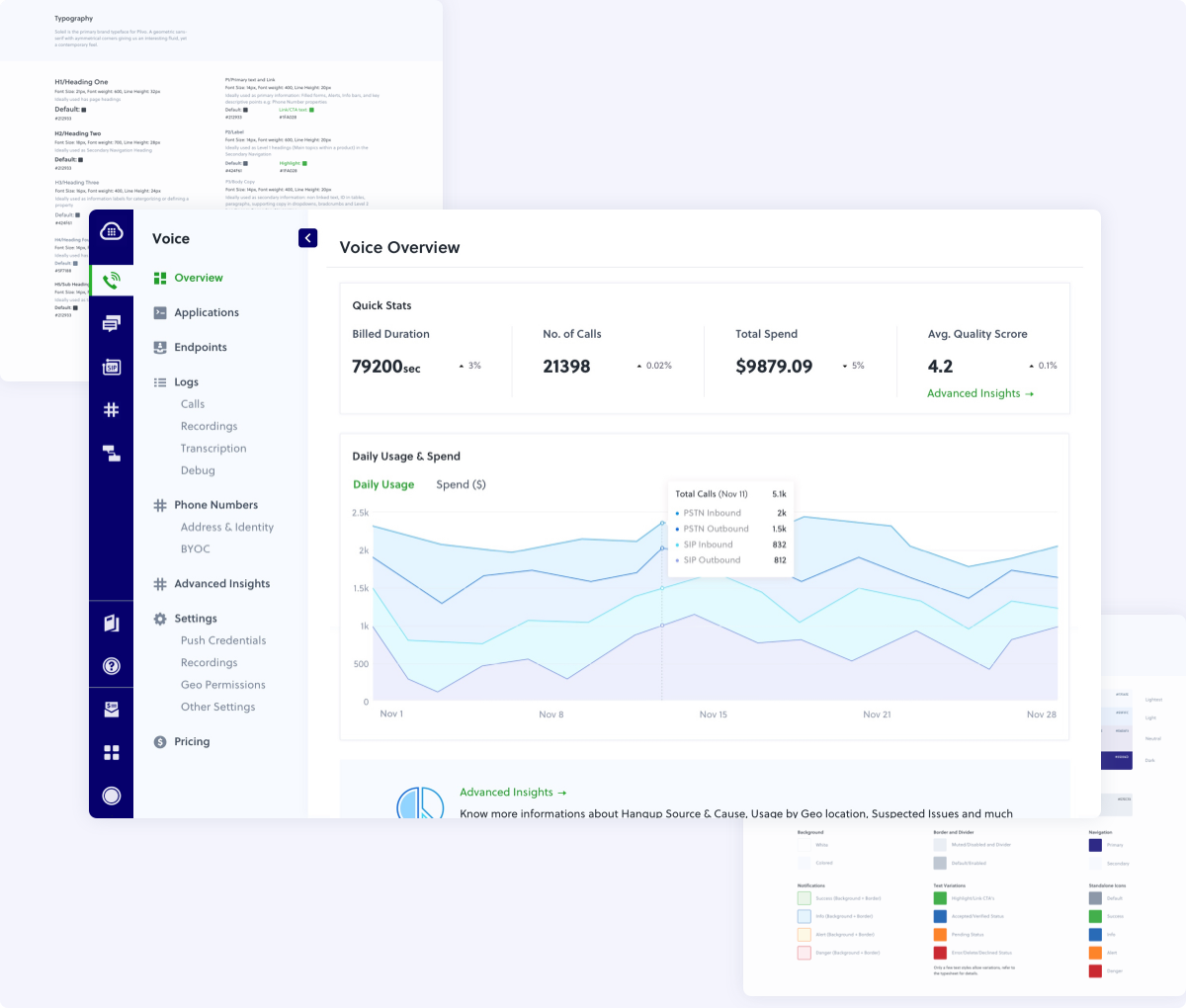
 Product-Specific Dashboards
I introduced landing pages with usage analytics for high-volume products (SMS and Voice), giving users visual data they previously could only find in raw logs.
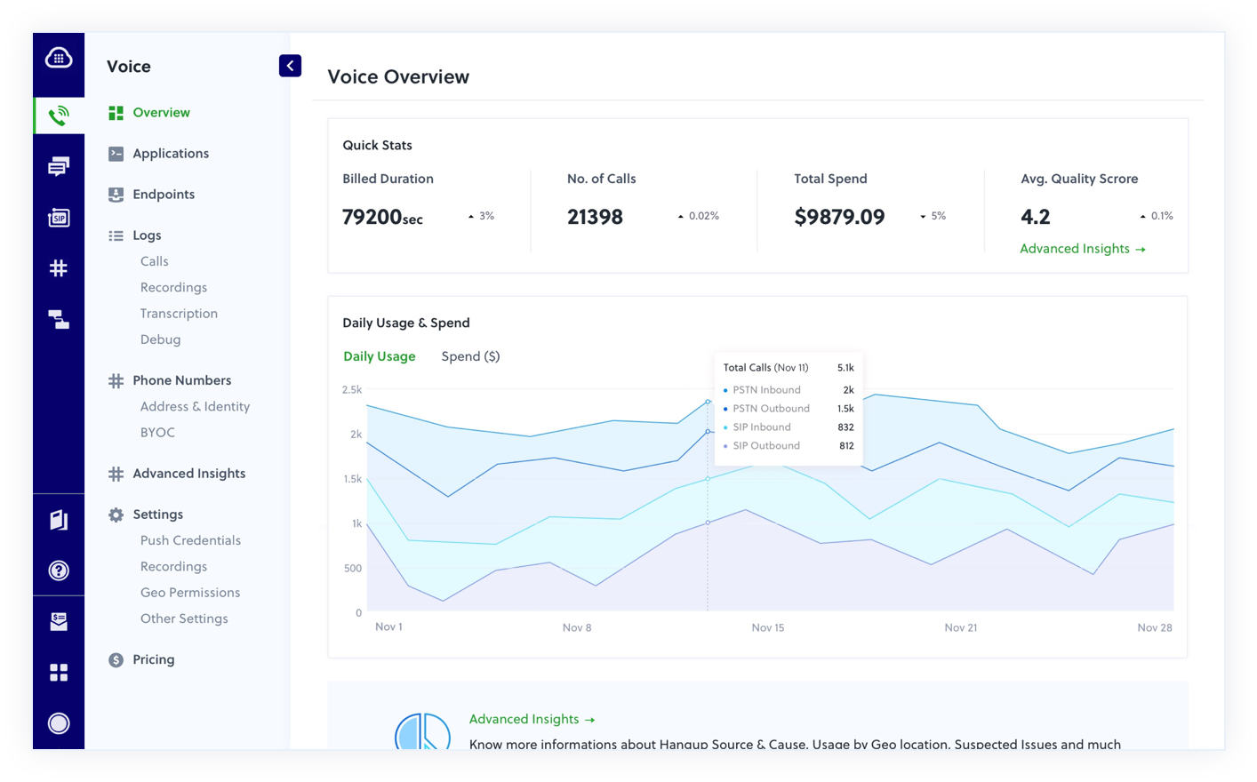 Product-specific dashboards with usage analytics for SMS and Voice
  Before and after: monolithic account settings split into Security and Finance pillars
 The Migration Strategy: Starve the Old, Feed the New
Rather than a risky "rip-and-replace" launch, I designed a phased rollout. Existing customers could toggle between the old and new interfaces, while net-new accounts defaulted to the new console. We stopped adding features to the old console. By "starving" the legacy interface, we successfully migrated the remaining holdouts and consolidated the codebase within a year.
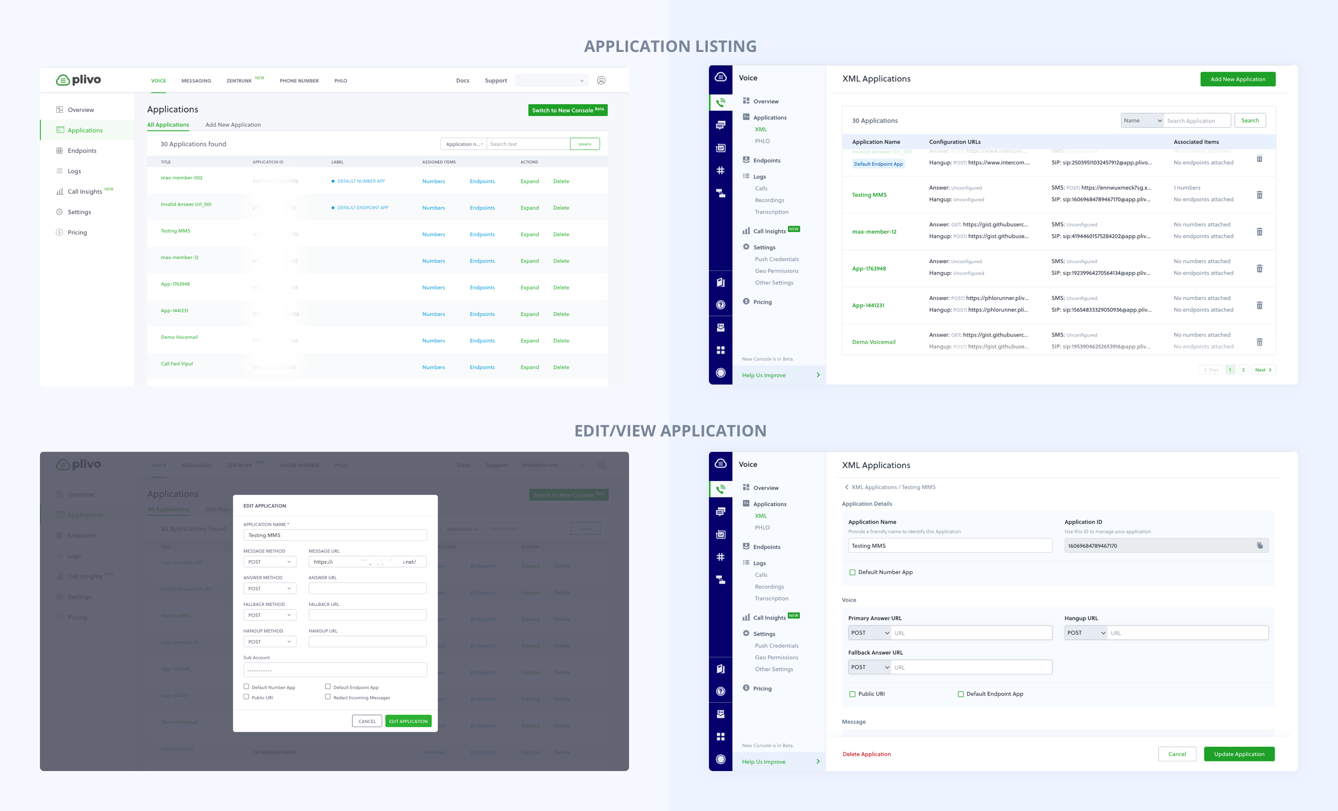 Legacy interface vs. new design system — before and after
 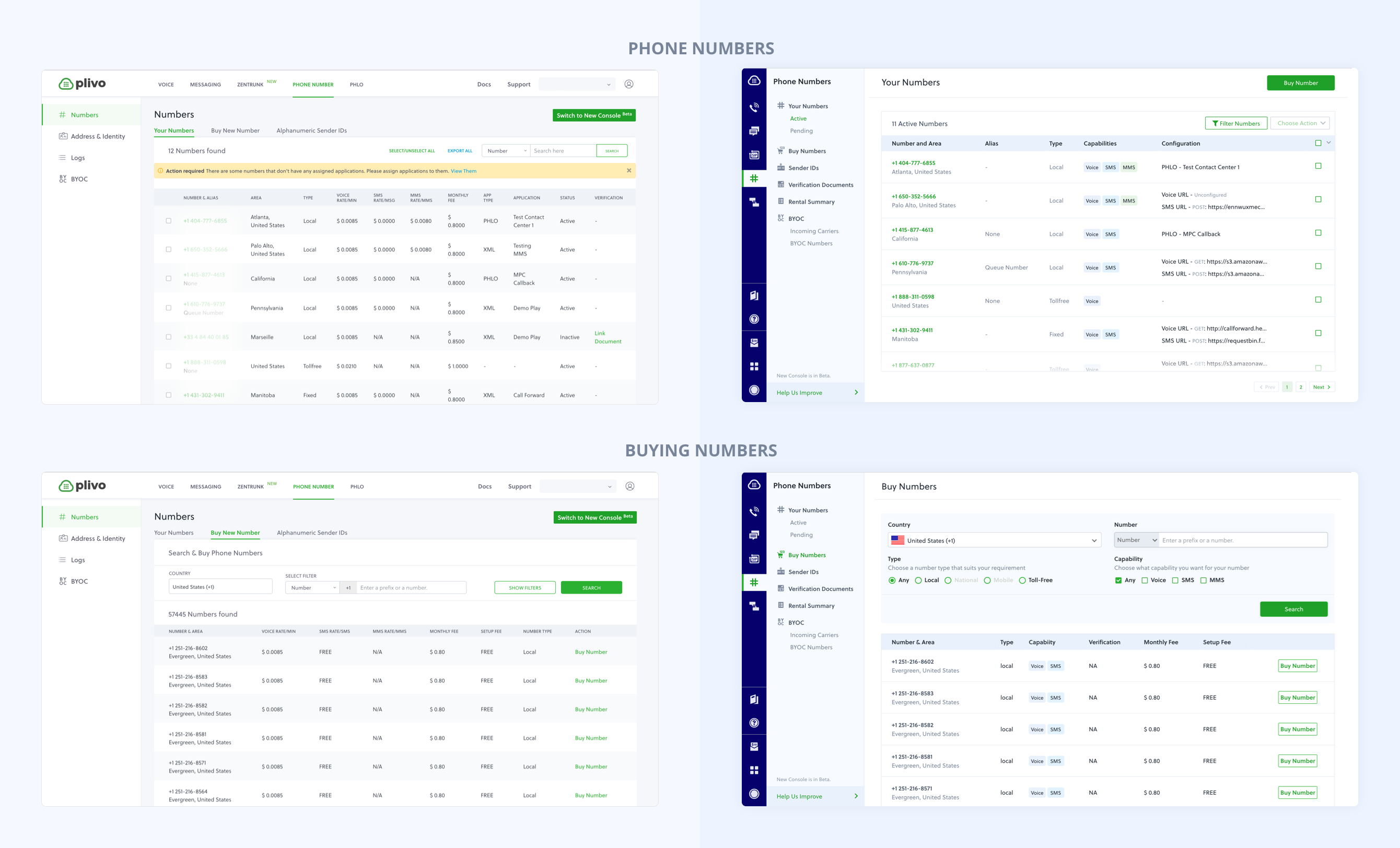 Migration from old to new console patterns across product areas
 Operationalizing Design (Scaling from 1 to 7)
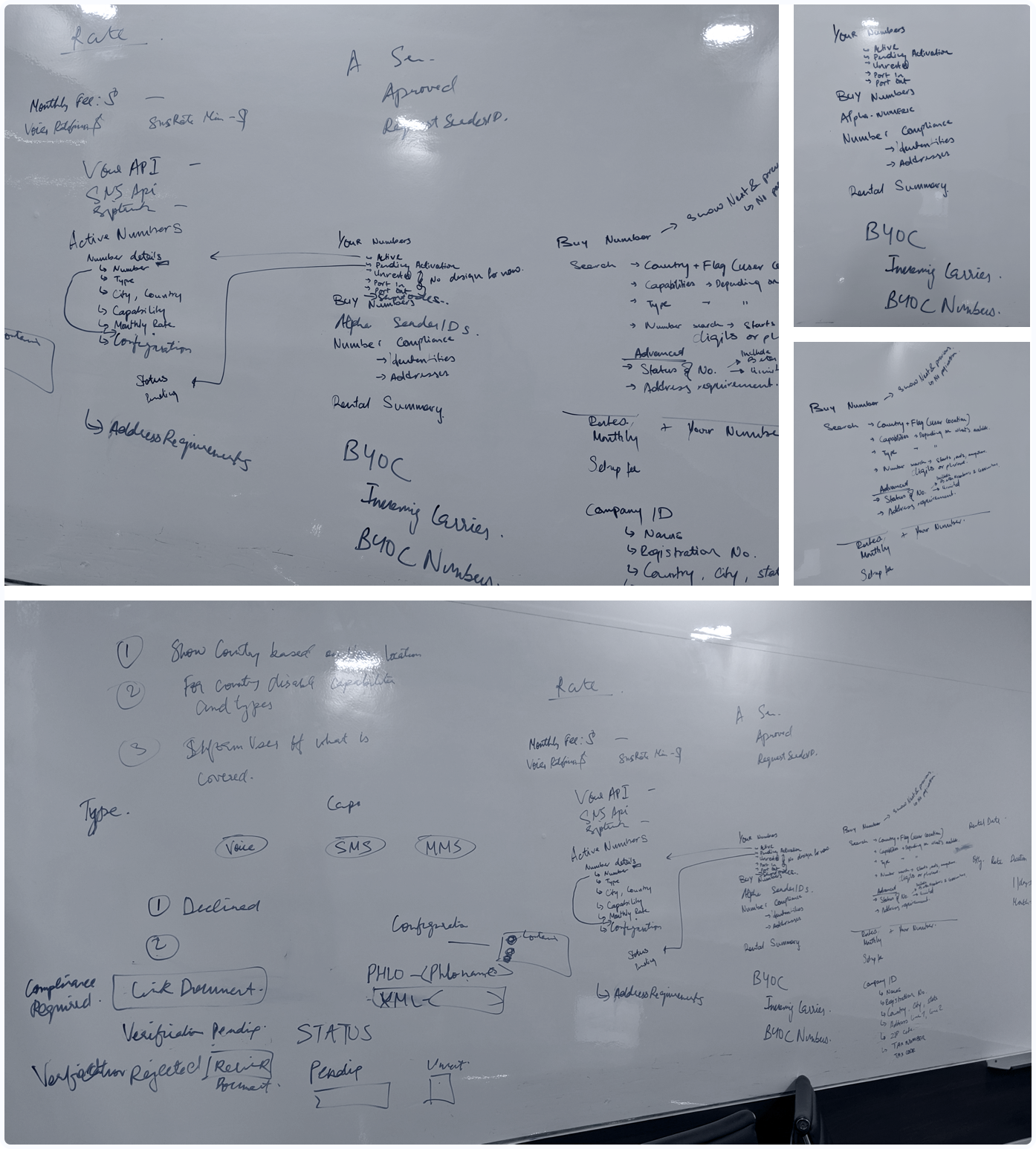
The most important part of this project was not the UI; it was the operations. As the design team grew from one to seven, I established a clear process for adding to the system: shared Figma libraries with defined component APIs, documentation standards, and a rigorous review process. Weekly design reviews became our quality control and education engine. New designers learned not just what the system contained, but the reasoning behind each constraint. This prevented one-off deviations and ensured the system stayed coherent.
 Design system contribution model: gap identification → proposal → review → master library → handoff
 The Outcome
- Rapid Adoption: Over 70% of legacy users voluntarily adopted the new console within the first three months.
- Engineering Velocity: Feature delivery accelerated massively, as engineers assembled shared components rather than building one-off implementations.
- The Foundation Years: This system became the base every Plivo product team built from, carrying product work for years until the platform consolidation that followed.
Reflection: Building for Handoff
Being the first designer at a fiercely engineering-led company means earning trust through rigor. I came in with a spreadsheet of inconsistencies and a clear operational plan. The engineers respected the logic, which opened the door for design to hold a strategic seat at the table for everything that came after.
The most enduring lesson: A design system that only works when its creator is present is not a system. The process and documentation I put in place meant the system scaled independently of me, freeing me to move up into the platform and product strategy work that defined my next four years.
This system did its job and then we outgrew it. When we merged four products into one platform, we moved to a shared component foundation (shadcn-based). Knowing when to retire a system you built is its own design decision.